adi.

Capitalise for Business is a SaaS platform for business owners to track and improve the financial health of their business through different credit and finance tools. You can read about the design of the platform in this case study.
Part of my role as a Lead Product Designer at Capitalise is to identify areas of the platform that appear problematic, are holding us back in terms of conversion, or need further attention in order to improve the overall experience for our customers.
For this project, given our new user acquisition targets for the quarter, I highlighted that our sign up page may be letting us down in terms of conversion. Below is the summary of how I went about identifying the issues, ideating possible solutions, and validating the designs through A/B tests to increase the conversion.
The scope for this project wasn't an entire redesign, but more iterative tests and optimisations that we could do to move the needle and increase conversion.
I'm a firm believer in setting specific A/B tests so that you know what change made an impact. And it's sometimes a very simple change that can make all the difference. You just need to figure out what that change is.
We often run CRO projects on key user flows. And overall, through a similar process, we managed to increase the conversion across multiple flows on the Capitalise for Business platform.
The Capitalise for Business sign up journey is a 2-step process. Step 1 - your personal details for account creation. And step 2 - your company details with company lookup. After the initial momentum of the launch a few months back we started to notice that conversion of the flow had started to flatten, and in some cases drop. We felt we could improve this.
After checking the sign up funnel in Mixpanel, it was obvious that the highest drop off was on the 1st step. And once a user had progressed past that initial step the conversion was high. So I decided to focus my attention on this first screen to identify any issues and what could be improved.

The personal details screen had the highest drop-off so I focussed my attention here.
After an audit and testing of the current designs, analysing the performance of different marketing display ads and messaging to see what was working, and gathering insights from user behaviour analytics I made the following suggestions:
1. Revised messaging to speak directly to the users and their needs.
2. Trust assets to build confidence/trust in the platform.
3. Better error handling to guide the user if there was an error.
4. Improved accessibility of form field inputs.
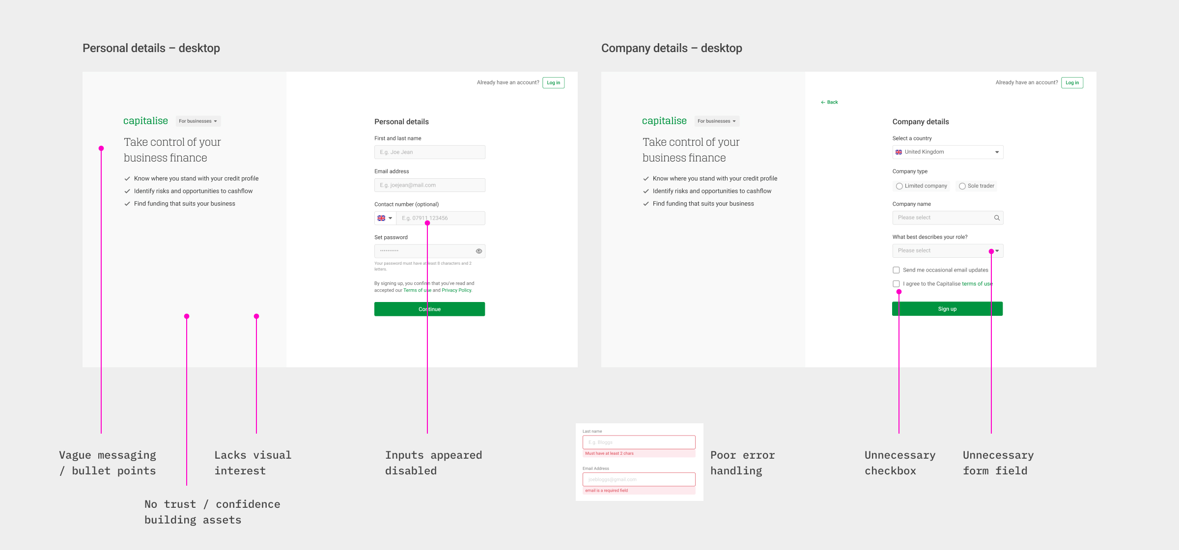
Some of the opportunities of where the experience could be improved.
I updated the designs based on the suggestions and we A/B tested this variant against our current version with a percentage of traffic to test the changes.

Improved form UI, and the trust asset variant that we tested.

I updated the wording on the error messages to be more informative.
Sharing the designs and my thoughts with the frontend engineer, he kindly created the test variant and the product manager setup the tracking in Mixpanel. The test was shipped. Now we wait...

Success. We were on the right track and our assumptions were validated.
Given the success of the first test, we decided to replace the current version with the newer variant that I had designed. And decided to test one more hypothesis that we had been discussing. On marketing display ads, we noticed that product visuals were performing significantly better than other ads, and we wanted to test a product visual in place of the photo and quote from the founder.

A/B test 2: Trust asset vs Product image
Designs were updated and the test went live. We wait patiently, again...

Pretty even split across the current design and challenger variant. I wasn't convinced though...
I started off by testing the sign up flow myself across different devices to see if there was anything glaringly obvious that was broken or a bug which may be impacting the user's experience. I couldn't spot anything that was obvious.
I jumped into Mixpanel where we track analytical events to have a look at the funnel and results of the test throughout the sign up flow. It looked pretty even when measuring sign up.start to sign up.complete, which initially I thought meant there was no significant improvement by showing a product image versus the quote. But on digging a bit deeper into the data and breaking it down by 'device type' and each specific interaction throughout the funnel, you could see that on desktop the product image was performing better, and on mobile the quote. This seemed pretty odd to me.

Breaking the chart down further by 'device-type' I could see that on mobile it performed worse, yet on desktop better.
Still not convinced on the outcome, I decided to watch a few Mouseflow recordings (of users interacting on the sign up page) to see if I could spot any issues. And that's when I noticed the bug...
In the recordings of mobile users, I noticed them trying to scroll further down (beyond the bottom-positioned image) thinking there was more content below. You see the product image was actually cropped (to reduce vertical scroll) and positioned at the bottom of the screen, as intended by design. However due to the area of the image that was visible, it occurred like there was further content below, which you couldn't scroll to.

The crop of the product image caused users to want to scroll beyond the image, thinking there was missing data. Not ideal.
I asked one of the engineers to extend the height of the image's container, to reveal more of the product visual. I knew it increase the overall page height, but I felt it might work... And it did! After making the tiny yet significant tweak, we noticed the conversion starting to tick up on mobile, surpassing that on desktop even. Victory!

The final results from CRO to the sign up flow.