adi.

Adrian Myburgh
Product and UX Designer
London – © Copyright 2023

At the time of this project I was the lead product designer at Sanlam Indie, an innovative startup within a corporate listed financial services company, Sanlam (one of South Africa's largest financial services company and Africa's largest insurance company).
Indie's mission – to democratise financial services by providing quality financial products, designed from the ground up, that are easy to access and understand creating wealth for your future. And we started that mission by selling fully underwritten life insurance online.
What started out as a wealth generation reward investment for Sanlam Indie life insurance customers, was later integrated into the larger group, with contributing products from different product houses.
How it works is that whenever you buy a financial services product (e.g. life insurance, disability cover, critical illness, etc) from Sanlam Indie, you'll be rewarded with up to 100% of your premium being invested into Wealth Bonus, at no extra cost.
So if you pay R2,000pm for life insurance for example, Sanlam Indie would invest R2,000 into your Wealth Bonus.
Wealth Bonus explainer video.
Your Wealth Bonus funds could be self-allocated to different portfolios that ranged in risk and tracked different underlying funds (E.g. A ratio of equities, cash, bonds, property as well as a selection of Sanlam's own ETFs).
Over time, at predefined milestones, a percentage of your Wealth Bonus would unlock, allowing you to withdraw cash from your investment into your own personal bank account.
As a policy holder with Wealth Bonus, I could see the investment total from within my Sanlam Indie life insurance dashboard, but other than that there weren't any further actions I could do online. And requests were coming through thick and fast from people wanting to reallocate their portfolio, view their growth, see their contributing products, and so on...
Sanlam Indie was growing rapidly and so was the number of policies sold each month. Strategic partnerships with banks and cellular network providers saw the total number of policy holders with Wealth Bonus exponentially increase. And as a result so did the number of support requests from policy holders wanting to manage their investment. Our small support team (~10 people) were becoming unindated with requests.
We urgently needed a way for policy holders to self-serve and access their investment on their own, without the help of the customer support teams. And this how the Wealth Bonus investment app came to be.
Wealth Bonus was currently only offered if you purchased life insurance through Sanlam Indie, and wasn't integrated into any of the other Sanlam product divisions (e.g. Sanlam Personal Finance, Sanlam Private Wealth, Sanlam Short Term Insurance, etc). As the popularity of Sanlam Indie took off in the South African market, the larger group company become more interested in folding the Wealth Bonus concept into their other product divisions.
With other product divisions involved, the strategy was to form focussed teams to tackle the different complexities in bringing this together. I formed part of the cross-functional, Design team, as the product designer working alongside a project manager/business analyst. And my role was to design the app's interface.

The different project teams that were formed. I was in the Design Workstream working closest with the Technical Workstream.

Sanlam Indie persona types and survey results.
I started covering all the previous research and insight boards that we had gathered over time prior to jumping into any design. I had a clear understanding of our persona types and great insight into our existing Wealth Bonus users, their needs and pain points when it came to their policy and Wealth Bonus.
Not long before this project kicked-off, I was involved in a market focus group workshop that focussed on people's understanding, mental model and perceptions when it came to loyalty reward programmes. Below are some of the recurring insights that I discovered.
At Sanlam Indie we would sometimes do multi-day user testing (that you can read about in this post that I wrote) to test other areas of the platform which was valuable to have on hand when it came to designing the interface's UI patterns and behaviours. Giving us a head start on what we knew worked well, as well as problematic areas that had been revealed through user testing.

Jobs-To-Be-Done format.
The Technical team led by our CTO had created user stories for the engineering teams. We referenced these, along with bringing in our own customer use cases that we had identified from a customer's perspective we created JTBD. We based these on our different persona types to make sure we covered all the needs of our most common customer types.

New user journey from marketing funnels or Sanlam product houses (E.g. Sanlam Indie)

Account registration user journey.

Existing user journey accessing new contributing products.
Working with the project manager I created user flows to outline the journey a customer would take depending on their use case. I.e. Was this a first time user accessing the Wealth Bonus platform? Was this an existing policy holder? Was this user who already had a Sanlam group product (not from Sanlam Indie)? Was this a user adding a new product to Wealth Bonus?

Starting to resemble an interface.
With the JTBD and the user flows, we created wireframes to start exploring how this might come together in an interface and experience for the customer. There was plenty of back and forth as we iterated and discussed patterns, elements and layouts that offered the best experience for the user. Isolated flows were prototyped to test internally, gather feedback and improve the designs.
Along the way I presented our progress to the rest of the Sanlam team, engineering team and facilitated workshops to refine and iterate on the wireframes.
A prototype of a later stage UI version.
As the wireframes became more refined I created a larger prototype that we used to test the different flows and actions that a user would take. I tested this with different people from Sanlam Indie, and other teams to validate our direction. We later tested this with people we recruited matching the persona types for further insights.
View the figma prototype here

Testing over video calls – thanks Covid lockdowns.

Insights gathered from some of the user tests.
Given the strategic partnerships and joint ventures already in place with Sanlam Indie and other companies, we identified that the design would need to be capable of being white-labelled.
This was a strong design factor when considering the foundational elements of the UI like the typography, colour palette, background colours, border-strokes and visual weighting and balance of the different elements.
The UI was designed and built using Sanlam Indie's design system, called Galaxy. Galaxy was v2 of the Sanlam Indie design system that I had designed prior to this in collaboration with a frontend engineer.
The design needed to cater for the most simplest mobile devices. Mobile penetration throughout South Africa and the rest of the continent is massive, but I'm not talking the latest iPhone or Samsung Galaxy smart phone. More commonly used mobile devices were much more simple "dumb" phones. With small processing capapbilities and limited features. So the design needed to bear this in terms of limiting the use of newer coding tech and large packet sizes.

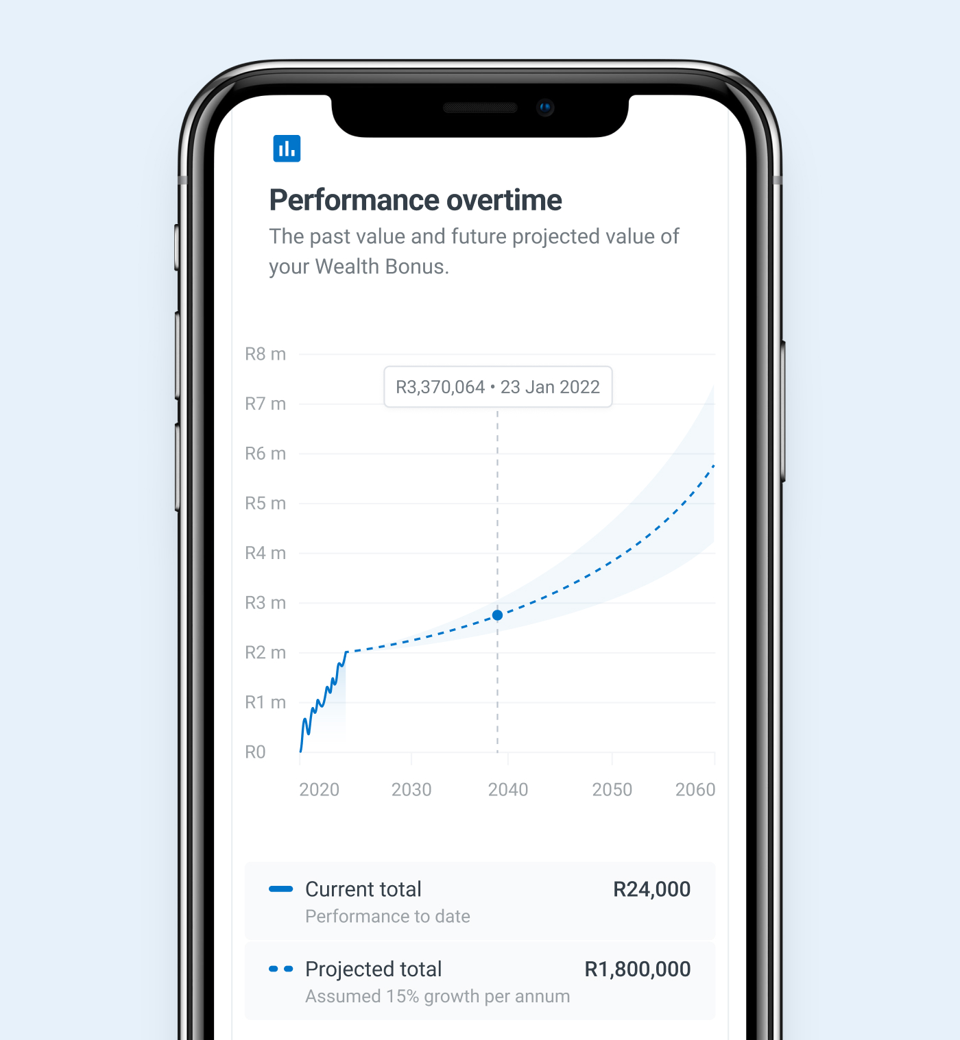
Investment overview showing a summary of your investment summary and growth.

High mobile usage required a fully responsive experience.

Changing your investment allocation to pre-defined funds or custom allocation. This was a tricky piece to design for...

Your transaction history including product contributions and any withdrawals.
Credit to a fantastic product manager, Jacques